Tuesday, June 24, 2014

A Tale of Two Cities:

Reaganite Republican ^ | 24 June 2014 | Reaganite Republican

Posted on ‎6‎/‎24‎/‎2014‎ ‎2‎:‎24‎:‎20‎ ‎PM by Reaganite Republican


Chicago, IL
 
Houston, TX
       
Population
2.7 million
 
2.15 million
       
Median HH Income
$38,600
 
$37,000
       
% African-American
38.9%
 
24%
       
% Hispanic
29.9%
 
44%
       
% Asian
5.5%
 
6%
       
% Non-Hispanic White
28.7%
 
26%
       

Pretty similar- until you compare the following...

 
Chicago, IL
 
Houston, TX
 
         
Concealed Carry gun law
no
 
yes
 
         
# of Gun Stores
0
 
184 - Dedicated gun stores plus 1500 - legal places to buy guns- Walmart, K-mart, sporting goods, etc.
 
         
Homicides, 2012
1,806
 
207
 
         
Homicides per 100K
38.4
 
9.6
 
         
Avg. January high temperature (F)
31
 
63


Democrat’s Conclusion:
Cold weather from
global warming causes murder.

-h/t Kirby-

What liberal media won't tell you: School shooting deaths down, not up, across America (Fox News)


By Dr. John R. Lott Jr.

Published June 20, 2014

FoxNews.com

Is there an epidemic of school shootings? Parents are understandably fearful, but their fear is unjustified. Schools are relatively safe places, and they have gotten much safer.

While even one death is too many, the number of children killed in school shootings has declined over the last couple of decades. The drop is even larger than the overall decline in the murder rate.

Last week, Michael Bloomberg’s various gun control organizations exacerbated the fears by claiming that there were 74 school shootings since the actual Newtown school shooting in December 2012, and that something must be done. But Bloomberg’s numbers were dead wrong. They inflated the number by including attacks that were off of school property and unrelated to the school, lone suicides well after school hours by adults, a justifiable defensive use of a gun and gang fights outside of school hours.

There have obviously been ups and downs from year to year since large school shootings are rare, but the five-year averages have shown a consistent drop in gun deaths. Even including the Sandy Hook Elementary School massacre, that is the trend.

Last week, CNN  investigated Bloomberg’s claim and said that over the previous 18 months, there had been 15 incidents where guns were brought onto school grounds in attempts to harm people.

But that is still a large number. A better measure is to focus on the amount of harm – the number of people killed – rather than the number of attacks.

On that front, things have improved dramatically over the last couple of decades. During the 2013-14 school year, there were three non-gang, non-suicide killings at universities, and three more at K-12 schools.

The National School Safety Center, a good source of statistics, started collecting data on K-12 violence in the 1992-93 school year. During the first five years, from 1992-93 to 1996-97, there were 26.8 gun murders per year on K-12 and university school property. In contrast, during the last five school years, 2009-10 to 2013-14, the average was 12 – a 55 percent drop.

There have obviously been ups and downs from year to year since large school shootings are rare, but the five-year averages have shown a consistent drop in gun deaths. Even including the Sandy Hook Elementary School massacre, that is the trend.

With 77 million Americans between the ages of 5 and 22, that implies a school murder rate of 0.008 per 100,000 people in the 2013-14 school year, well less than 1 percent of the overall murder rate.

But mass school shootings aren’t the only thing where reality differs from people’s perceptions.  Overall, firearm homicide rates have plummeted as much as the firearm murders at school since 1992 (a 52 percent drop by 2012), but a recent Pew poll shows 45 percent of Americans believe that firearm homicide rates have gone up, only 10 percent realized that the rate had actually gone down.

The same misperception is happening on mass school shootings.

The media shapes our views on guns and crime in other ways.  What the media deems “newsworthy” doesn’t always give Americans an accurate measure of what is happening.  Take the case of defensive gun uses.  When was the last time you watched the national news and saw a story about someone using their gun to save a life? Yet, the national news ignores stories of guns being used to save lives, but the best estimates from survey data indicate that defensive gun uses are about four to five times more common than crimes committed with guns.

Of course, the media’s understandable obsession with newsworthiness not only gives Americans a misimpression of what is happening to crime rates and mass killings, but it also encourages mass killers, who thrive on this attention. Reading the Santa Barbara killer’s manifesto, it is clear that he was just one more person who craved attention and felt he could get it by killing as many people as possible.

Unfortunately, these misimpressions caused by the media have real consequences. Legislation gets passed that disarms law-abiding citizens and makes attacks more likely.

John R. Lott, Jr. is a columnist for FoxNews.com. He is an economist and was formerly chief economist at the United States Sentencing Commission. Lott is also a leading expert on guns and op-eds on that issue are done in conjunction with the Crime Prevention Research Center. He is the author of eight books including "More Guns, Less Crime." His latest book is "Dumbing Down the Courts: How Politics Keeps the Smartest Judges Off the Bench" Bascom Hill Publishing Group (September 17, 2013). Follow him on Twitter@johnrlottjr.

+ FollowFoxNewsOpinion on Facebook

Monday, June 23, 2014

Data Tampering At USHCN/GISS (from Real Science)

Data Tampering At USHCN/GISS

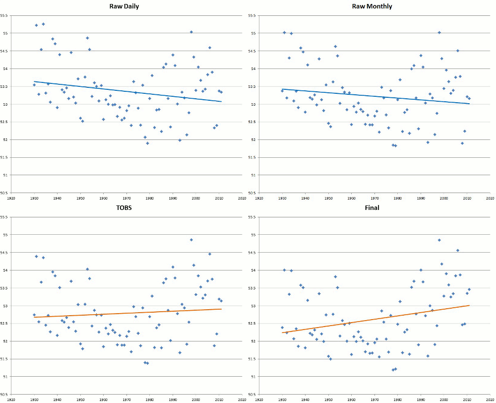
The measured USHCN daily temperature data shows a decline in US temperatures since the 1930s.  But before they release it to the public,  they put it thorough a series of adjustments which change it from a cooling trend to a warming trend.

The graph below shows the difference between the published data and the measured data.

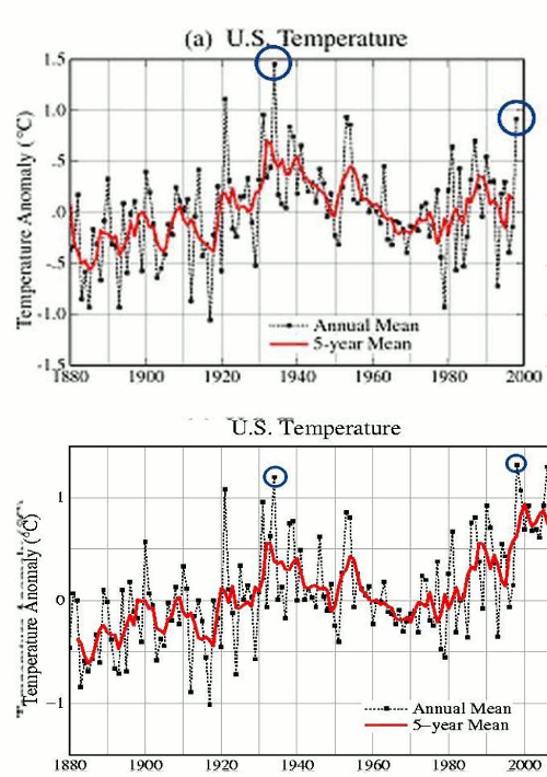
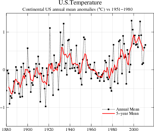
The next blink comparator shows changes in the US temperature record from GISS. It alternates between their 1999 graph and the 2012 version of the same graph. The past is cooled and the present is warmed.

The next graph shows the difference between the 2012 version of the GISS US temperature graph, and 1999 version.

How the US hockey stick was built

As of 1999, there wasn’t any warming in the US

Hansen made these remarkable comments in 1999 :

Empirical evidence does not lend much support to the notion that climate is headed precipitately toward more extreme heat and drought. The drought of 1999 covered a smaller area than the 1988 drought, when the Mississippi almost dried up. And 1988 was a temporary inconvenience as compared with repeated droughts during the 1930s “Dust Bowl” that caused an exodus from the prairies, as chronicled in Steinbeck’s Grapes of Wrath…..

in the U.S. there has been little temperature change in the past 50 years, the time of rapidly increasing greenhouse gases — in fact, there was a slight cooling throughout much of the country

NASA GISS: Science Briefs: Whither U.S. Climate?

At that time, GISS US temperature data showed an 80+ year decline in US temperatures, with 1934, 1921 and 1931 being the three hottest years

This data has been deleted from the GISS web site, but originally resided at this URL

gistemp/graphs/FigD.txt

It has been archived here :

www.john-daly.com/usatemps.006

The next graph shows the 1920-1999 changes which Hansen made to the US temperature record since 1999 – in GISS version 3.

gistemp/graphs_v3/Fig.D.txt

The GISS US temperature graph looks like this

Fig.D.gif (513×438)

The next blink comparator shows the changes that were made to the US temperature data since 1999. The year 1998 was promoted from #4 to #1.

Hockey sticks are indeed man-made – by climate activists pretending to be scientific heads of government agencies.

Thursday, June 19, 2014

A Cold Dawn Coming (American Thinker)


By David Archibald
There was a time in climate science when tree rings were used for good instead of evil, a time of innocent enquiry, a time that ended with the noble-cause corruption. From that time, one of the best predictions of climate ever made (weighted for distance and accuracy) was by two Californian researchers, Leona Libby and Louis Pandolfi. In 1979, they used tree ring data from redwoods in Kings Canyon to make a remarkably accurate forecast1 From a Los Angeles Times interview of that year,
When she and Pandolfi project their curves into the future, they show low!r average temperatures from now through the mid-1980s.  “Then,” Dr. Libby added, “we see a warming trend (by about a quarter of 1 degree Fahrenheit) globally to around the year 2000.  And then it will get really cold—if we believe our projections.  This has to be tested.”
How cold? “Easily one or two degrees,” she replied, “and maybe even three or four degrees.”
Three or four degrees! That would be worth confirming wouldn’t it? Confirmation had to wait almost thirty years later in a conference poster by Finnish forestry workers (Timonen et al 2007):

Figure 1:  Finnish climate prediction based on Scots pine tree ring data
The tree ring readings of the Finnish foresters are predicting a large decline in temperature bottoming out in about 2045. The downturn you see on the right hand side of the graph is as large as any in the last 200 years. A cold period longer and deeper than any other in the last 200 years would have lots of real world consequences. That would be worth following up on, wouldn’t it?
Well, we now have a way of cross-checking the tree-ring based predictions. A just-released climate model using a notch-delay filter has the promise of providing much higher resolution in climate forecasting. Using historic TSI data, the model can see out to 2025:

Figure 2:  Notch-Delay climate model and the UAH temperature record with a projection to 2020
The figure above shows the model output plotted against the UAH temperature record. It shows a very steep decline starting in late 2014 and ending in June 2016. After that it trends sideways for the rest of the decade. The green box shows the expected temperature range in this period. The predicted decline to mid-2016 is 0.6°C. That is not remarkable in itself. There are a few declines of that magnitude in the 34 years of the satellite record. The remarkable thing will be that the temperature will not bounce back.
We can predict out a further couple of decades using a prediction of Solar Cycle 25 peak amplitude of 7 (Livingstone and Penn) and the Lean 2000 TSI reconstruction back to 1610 as an indication of what TSI will fall to under Dalton/Maunder Minimum-like conditions:

Figure 3: Notch-Delay climate model and the CET record with a projection to 2045
The figure above plots the notch-delay model output against the Central England Temperature (CET) record. The hindcast match is good. The interesting thing is that the projected temperature decline of 3.0°C is within the historic range of the CET record. The low is reached about 2045, lining up with the projection from the Finnish tree ring study. Maunder and Dalton Minimum-like levels of solar activity will be associated with temperature levels similar to those recorded during these minima. There is nothing remarkable about that observation but it seems to be needed to be said.
There is another paper deriving Dalton-like levels of solar activity by the second half of the century. From Steinhilber and Beer in 2013:

Figure 4:  A prediction of solar activity to 2500
Let’s go on to consider some of the real-world impacts of the temperature decline coming. The big one is the reduction in agricultural production in prospect. Back in 1980, Newman determined that each 1.0°C change in annual average temperature moved the Corn Belt 144 km. The Midwest gets more polar amplification than the CET record so the temperature decline in prospect is larger at 4.4°C.  From the Corn Belt, this is the prediction for Whitestown, Indiana.

Figure 5:  Notch-Delay climate model applied to the Whitestown, Indiana temperature record
There are several factors that affect agricultural productivity:
  1. Productivity is directly proportional to temperature in the mid-latitudes.  For the Corn Belt it is 10% per 1.0°C of average annual temperature.  Corn requires temperatures above 10°C, wheat above 4°C.  Where it is too cold to get a corn crop off in a season, wheat is grown.  Where too cold for wheat, rye and oats are possible.
  2. As growing conditions move south, some formerly productive land will be abandoned.
  3. Regions in the south in which the length of the growing season allows double cropping will be reduced to one crop per season.
  4. Wheat production could go up by a switch from hard summer wheat to winter wheat which has a lower protein content and makes lower quality bread.
  5. Production will respond to higher prices – several farmers from the Midwest have told me that they could have a big increase in production with the right price signal.
  6. Large areas of land in the southeast and northeast US that are currently non-competitive with the Corn Belt could be brought into production with the right price signal.
  7. Also with the right price signal, a lot of food could be grown residentially. During WW2, 40% of U.S. vegetable production was from domestic plots. The appropriate high protein plant crop is soybeans which are 12% protein in the green bean. You can grow potatoes easily enough but they are only 2% protein.
All things considered, the production decline for U.S. agriculture could be 8% per 1°C. A fall of 3°C and the United States would be out of export markets for agricultural products, with the same true of most mid-latitude grain exporters. This will have profound geopolitical implications -- namely, starvation and collapse for countries that import food. That’s for next decade. This decade, once the temperature decline is widely apparent, currently importing countries around the world will rush to stockpile, bringing forward the price effect of scarcity.
If this sounds like the reverse echo of the global warming crowd, how often have leftist wealth-redistributors been right about anything? Given their track record, the exact opposite is the more likely outcome. We should be ever thankful to them though. If it wasn’t for their melodramatic predictions attracting honest scientists into the climate science field, humanity would be sleepwalking into the climatic and agricultural disruption that is coming. We will still have the consequent famine and death but we will know what’s causing it at the time.
P.S. -- Cold-driven famines over the last few hundred years are well documented.  Severe cold in the 1690s killed 30% of the population of Finland, and lesser percentages of other countries from France to Sweden. In Ireland, 20% of the population died in 1740, one hundred years before the more famous potato famine.  In 1816, the Swiss were eating their cats, dogs, rats and horses.
David Archibald, a Visiting Fellow at the Institute of World Politics in Washington, D.C., is the author of Twilight of Abundance: Why Life in the 21st Century Will Be Nasty, Brutish, and Short (Regnery, 2014). 

Friday, June 13, 2014

12 Numbers About The Global Financial Ponzi Scheme That Everyone Should Know


Submitted by Tyler Durden on 06/12/2014 19:58 -0400

Submitted by Michael Snyder of The Economic Collapse blog,

The numbers that you are about to see are likely to shock you.  They prove that the global financial Ponzi scheme is far more extensive than most people would ever dare to imagine.  As you will see below, the total amount of debt in the world is now more than three times greater than global GDP.  In other words, you could take every single good and service produced on the entire planet this year, next year and the year after that and it still would not be enough to pay off all the debt.  But even that number pales in comparison to the exposure that big global banks have to derivatives contracts.  It is hard to put into words how reckless they have been.  At the low end of the estimates, the total exposure that global banks have to derivatives contracts is 710 trillion dollars.

That is an amount of money that is almost unimaginable. And the reality of the matter is that there is really not all that much actual "money" in circulation today.  In fact, as you will read about below, there is only a little bit more than a trillion dollars of U.S. currency that you can actually hold in your hands in existence.  If we all went out and tried to close our bank accounts and investment portfolios all at once, that would create a major league crisis.  The truth is that our financial system is little more than a giant pyramid scheme that is based on debt and paper promises.  It is literally a miracle that it has survived for so long without collapsing already.

When Americans think about the financial crisis that we are facing, the largest number that they usually can think of is the size of the U.S. national debt.  And at over 17 trillion dollars, it truly is massive.  But it is actually the 2nd-smallest number on the list below.  The following are 12 numbers about the global financial Ponzi scheme that should be burned into your brain...

-$1,280,000,000,000 - Most people are really surprised when they hear this number.  Right now, there is only 1.28 trillion dollars worth of U.S. currency floating around out there.

-$17,555,165,805,212.27 - This is the size of the U.S. national debt.  It has grown by more than 10 trillion dollars over the past ten years.

-$32,000,000,000,000 - This is the total amount of money that the global elite have stashed in offshore banks (that we know about).

-$48,611,684,000,000 - This is the total exposure that Goldman Sachs has to derivatives contracts.

-$59,398,590,000,000 - This is the total amount of debt (government, corporate, consumer, etc.) in the U.S. financial system.  40 years ago, this number was just a little bit above 2 trillion dollars.

-$70,088,625,000,000 - This is the total exposure that JPMorgan Chase has to derivatives contracts.

-$71,830,000,000,000 - This is the approximate size of the GDP of the entire world.

-$75,000,000,000,000 - This is approximately the total exposure that German banking giant Deutsche Bank has to derivatives contracts.

-$100,000,000,000,000 - This is the total amount of government debt in the entire world.  This amount has grown by $30 trillion just since mid-2007.

-$223,300,000,000,000 - This is the approximate size of the total amount of debt in the entire world.

-$236,637,271,000,000 - According to the U.S. government, this is the total exposure that the top 25 banks in the United States have to derivatives contracts.  But those banks only have total assets of about 9.4 trillion dollars combined.  In other words, the exposure of our largest banks to derivatives outweighs their total assets by a ratio of about 25 to 1.

-$710,000,000,000,000 to $1,500,000,000,000,000 - The estimates of the total notional value of all global derivatives contracts generally fall within this range.  At the high end of the range, the ratio of derivatives exposure to global GDP is about 21 to 1.

Most people tend to assume that the "authorities" have fixed whatever caused the financial world to almost end back in 2008, but that is not the case at all.

In fact, the total amount of government debt around the globe has grown by about 40 percent since then, and the "too big to fail banks" have collectively gotten 37 percent larger since then.

Our "authorities" didn't fix anything.  All they did was reinflate the bubble and kick the can down the road for a little while.

I don't know how anyone can take an honest look at the numbers and not come to the conclusion that this is completely and totally unsustainable.

How much debt can the global financial system take before it utterly collapses?

How recklessly can the big banks behave before the house of cards that they have constructed implodes underneath them?

For the moment, everything seems fine.  Stock markets around the world have been setting record highs and credit is flowing like wine.

But at some point a day of reckoning is coming, and when it arrives it is going to be the most painful financial crisis the world has ever seen.

If you plan on getting ready before it strikes, now is the time to do so.